
7 Branding Color Palettes Inspired By Summer
If you belong to any marketing groups on Facebook, you’re likely to have seen the ColorKuler Instagram palette generator floating around somewhere. This generator “looks” at your Instagram and creates a color palette based on the photos.
The below example is from the MoxieDot Instagram:

When I first did the ColorKuler generator, I didn’t think much about it…just considered it a fun activity without major value. I was so wrong.
This palette generator is a great indicator of what colors you tend to use. This is helpful for a brand to know; the brand learns if they are using brand colors or a random assortment of colors. While this intelligence may not result in any immediate action, it’s important to have the insight.
All of this “color talk” has us thinking about color palettes! If you’re anything like us, you’re constantly creating new social media templates or blog post headers, both of which require a color scheme. So we decided to take the hard job of figuring out which colors to use by showing some of our favorite summer color palettes!
Check out the below palettes for inspiration!:
Seagull’s Seaglass

When you think “summer,” you can’t help but to think of the beach, right? Okay, same here! So our inspiration for “Seagull’s Seaglass” is the beach plus some flying ‘gulls! It’s pretty simple in theory but when you break down the colors, you get a very calming palette. This palette works for a professional project or fun interlude. Either way, we love these colors because they remind us of a relaxing day at the beach with our birds of choice. So even if you can’t make it to the beach, this palette brings the feeling to you!
Pop of Orange

We’ll be honest, we didn’t have to work too hard on this palette’s name. We wanted to create a palette that was beach inspired without focusing on the ocean. We decided instead to highlight the sky and sand while allowing for a fun color pop. This pop of orange keeps what could be a safe palette adventurous! This palette has a strong range while also having a variety of pairing options.
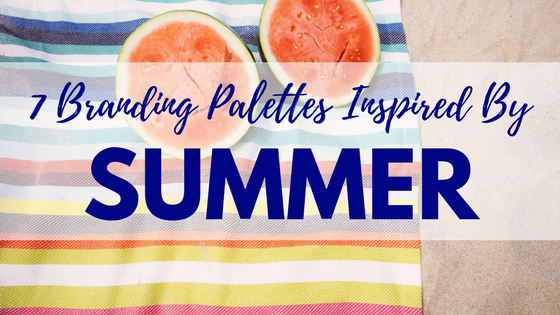
A Terrific Towelling

We loved our first two palette’s so much that we got inspired: we combined them into one killer combo! The cute photo brought back childhood memories of picking the brightest beach towel so we wanted to capture that feeling in a color palette. Although we picked a wide variety of colors, there is a strong similarity between them: they all feel like a “dusty” version of the color. Maybe I am crazy for thinking that way but I loved typically bright colors that had been dimmed or muted.
Anything-But-Simple Sunset

We would be remiss to not include a sunset picture for our summer-inspired color palettes! Rather than choosing a sunset with the typical bright reds and oranges, we instead chose a unique smattering of colors. We loved the idea of a “lilac sky” so we want a picture that made you feel warm while soothing you. I think of this as a sassy sunset. Yes, it’s got some bright orange but it still soothes the soul with soft lilacs and pale blues.
Delightful Drips

Remember when it was summer vacation and the ice cream truck trolled the neighborhood? We wanted to bring back that feeling by evoking the memory of a dripping ice cream cone in the summer heat. We love a crunchy waffle cone, a sweet strawberry ice cream, and the wafting of the scent of vanilla. By again using muted versions of fun and poppy colors, we can create a calming feeling around a fun memory.
Sweet & Sour

We know that the yellow, orange, and green pop but our personal favorites are the nude/tan shades. These are the supporting players who steal the spotlight without demanding it. This sweet palette alludes to fruity scents, summery shades, and calming neutrals. What’s not to love? This is a fun twist on a traditionally “citrus” palette by including the almond and pale orange shade. They offer a surprisingly iconic contrast that we can’t get out of our heads.
Palm Paradises

Palm trees = enviable destinations. There’s no way around it: the best places have palms. Okay, maybe we are a biased Floridian who currently lives in California but our visions of pools and beaches are matched with images of palm trees. After all, where do you think the coconuts in Pina Coladas come from? We love this palette because it includes all greens while fully exploring their variations. For example, the Ash Grey includes hints of blue while the Dark Vanilla brings in yellow tints.
So whatever you’re designing, let our palettes help you to create a new palette inspired by one of our favorite seasons! If you have a palette you love, reach out to us! We’d love to spotlight it in our next edition of color palettes!
All photographs are from Pixabay and all color palettes were created with Coolors.
Latest posts by Guest Author (see all)
- How To Own The Holidays - December 21, 2018
- Marketing Analytics 101 - November 28, 2018
- What a Marketer Should Do on Thanksgiving - November 16, 2018