
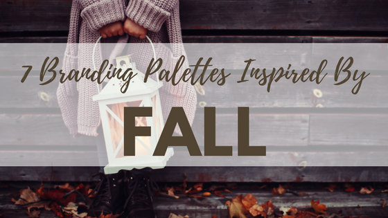
We love September for two important reasons: 1) it’s the official start of fall and 2) it’s the beginning line of the best Earth, Wind and Fire song.
If you’re like us, you’ve been waiting for what feels like a year for fall. This season is full of magical moments like waiting in line for your first PSL and Harry Potter movie marathons.
Now, close your eyes and think about what first comes to mind when you think of this amazing season. Here’s what we come up with: red and orange leaves, cinnamon, and cranberry sauce.
We are turning these ideas into seasonally appropriate branding color palettes. Check out the below palettes for inspiration!
Plaid Perfection

We all have a favorite piece of plaid that we wait to wear each fall season. It’s comfy, cozy, and the perfect addition to any outfit. We think that this photo is the picture of all things fall so we wanted to create a palette that gave us the same warm fuzzies a scarf like this does. We love that this palette uses warm yet bold colors, perfect for a brand looking to make a strong first impression.
Throw Leaves To The Wind

It’s tough to think about fall and not instantly think of the changing leaves. What childhood wasn’t impacted by playing with the fallen leaves or at least raking up the leaves? This photo gives us all the feels while making us feel warm inside. We love the warm orange tones matched with the cooler grays and taupe.
Ah-maize-ing Season

I mean, if you didn’t think that we had to make a corn-y joke here, you were mistaken. Whether you’re a fan of decorative corn or just like to eat it, it’s hard to envision the pilgrims without this seasonal staple. Not only does this picture show tons of interesting texture, it shows the spectrum of colors in corn. From a charred smoky black to a sweet butter yellow, brands can find inspiration in these understated by cool color pairings.
Fall’s Rainbow

Traditionally when we think fall we think or beautiful ambers, burnt oranges, golden yellows, and earthy browns, but there is still space for a spot of bright, fun, colors. This aerial shot of trees during fall shows the crazy spectrum of colors. From a beautiful blue-green to a raspberry pink, you can’t go wrong with choosing this palette to create your motif.
Sweater Weather

As a lover of all things muted and neutral, this might be my favorite palette. This colors are comforting, dusty, and feel well-worn, just like your favorite sweater. Not only is this my favorite palette of the bunch but it’s also the one that I think is best for professional uses. While it’s cool enough to be anyone’s palette, the law firm you are designing for will also appreciate it.
Autumn’s Inferno

I don’t know about you, but this palette is giving me all the fire feels. I love the contrast between the bright blue sky and the orange-yellow tree. On first glance, it almost looks the tree has caught on fire. This is a fun palette for fall because the addition of the bright blue shades is an uncommon fall color choice. So keep things exciting by adding these colors to your inspiration board.
Forever Foliage

This cute couple is giving us major couple goals so we had to attempt to bottle that feeling up in this palette. As always, we are a sucker for warm, light-colored taupes but love them paired with the brighter jewel tones. The musty green relaxes us, the navy adds a surprising twist while the red provides the warmth.
So no matter what you’re creating, our palettes help you to create a new color scheme inspired by one of our favorite seasons! If you have a palette you love, reach out to us! We’d love to spotlight it in our next edition of color palettes!
Still looking for palette inspiration? Check out our blog post on branding color palettes inspired by summer!
All photos from Unsplash and color palettes from Coolors.
Latest posts by Guest Author (see all)
- How To Own The Holidays - December 21, 2018
- Marketing Analytics 101 - November 28, 2018
- What a Marketer Should Do on Thanksgiving - November 16, 2018