

Ahhh, winter! What’s not to love? Between the cozy sweaters and yummy Starbucks drinks, we just can’t pick a favorite. While every season is special, there’s something about getting to wear your favorite leather boots and jacket.
When I think of winter, I think of snow, cool toned-colors, mountains, and pink cheeks. Yes, some of us live in places that don’t fully experience each season but it doesn’t mean that we love them any less.
With this in mind, we will turn each of these winter mementos into seasonally appropriate branding color palettes. Check out the below palettes for inspiration!
Coffee Cures
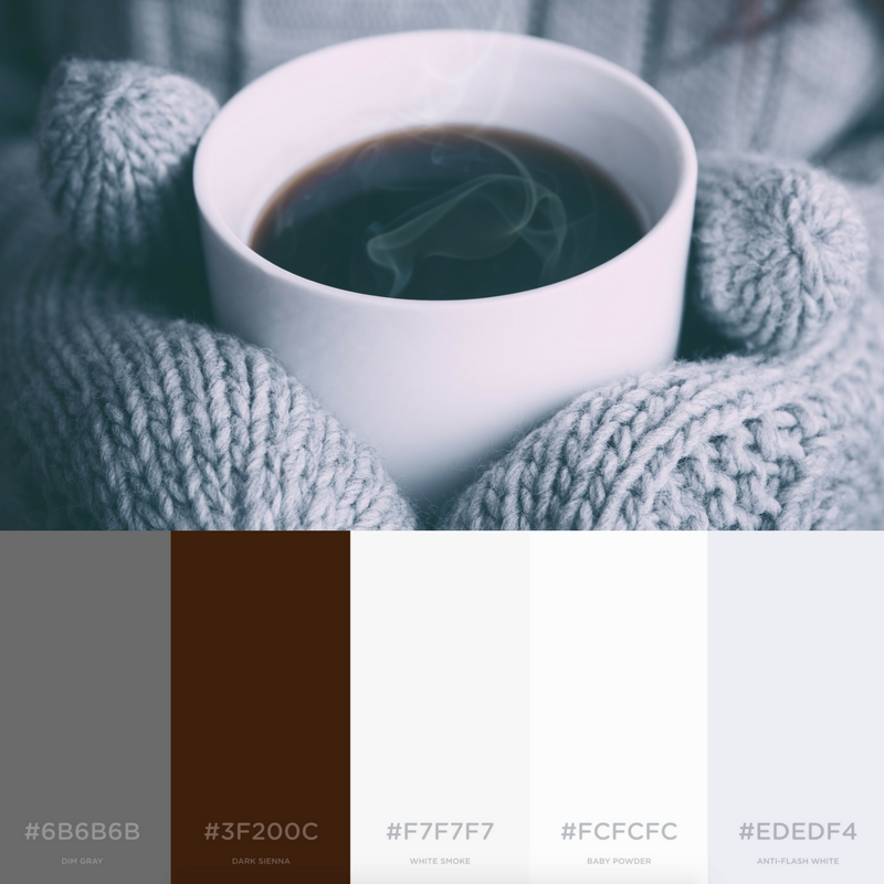
Mmmm, what’s better than a steaming cup of joe? We love this simple color palette that showcases the range of “white.” Professional brands can find their inspiration in this collection of whites while the gray and brown emphasize boldness.
Crystallized Calm
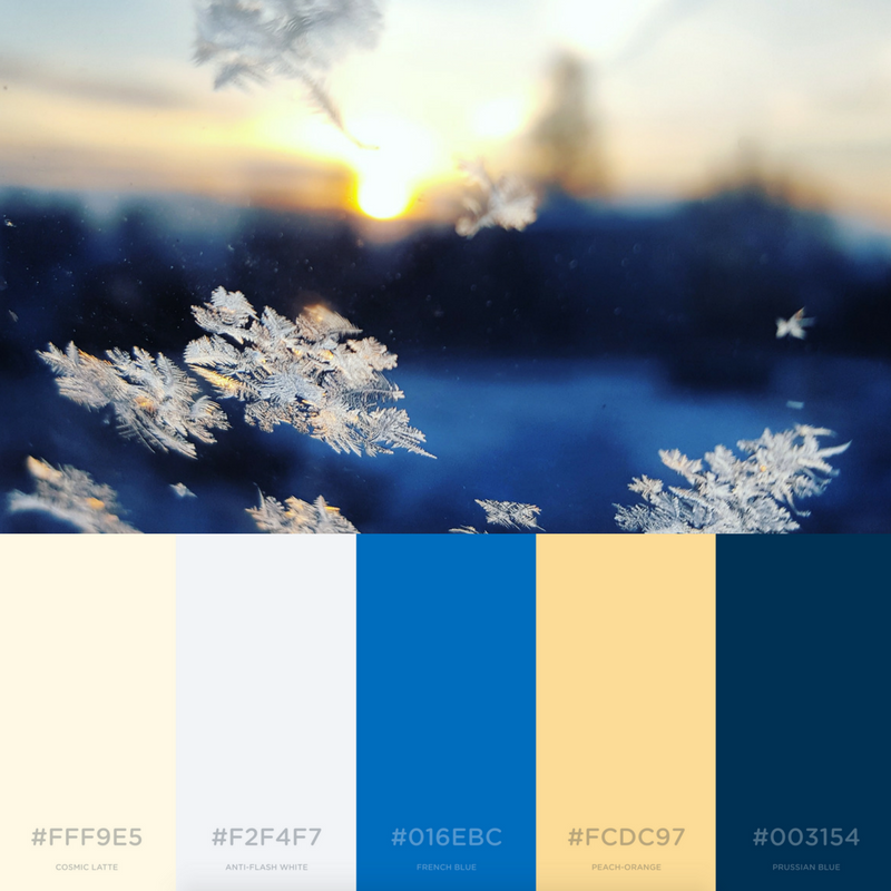
How could anyone be stressed when looking at this beautiful photo? Between the beauty of the snowflakes and the sneaking up sun, we don’t know where to look first. These colors are professional yet so calming. With the strong and sturdy blues, the open and trustworthy yellows warm us starting with our core.
Sweet, Sweet, Starbs
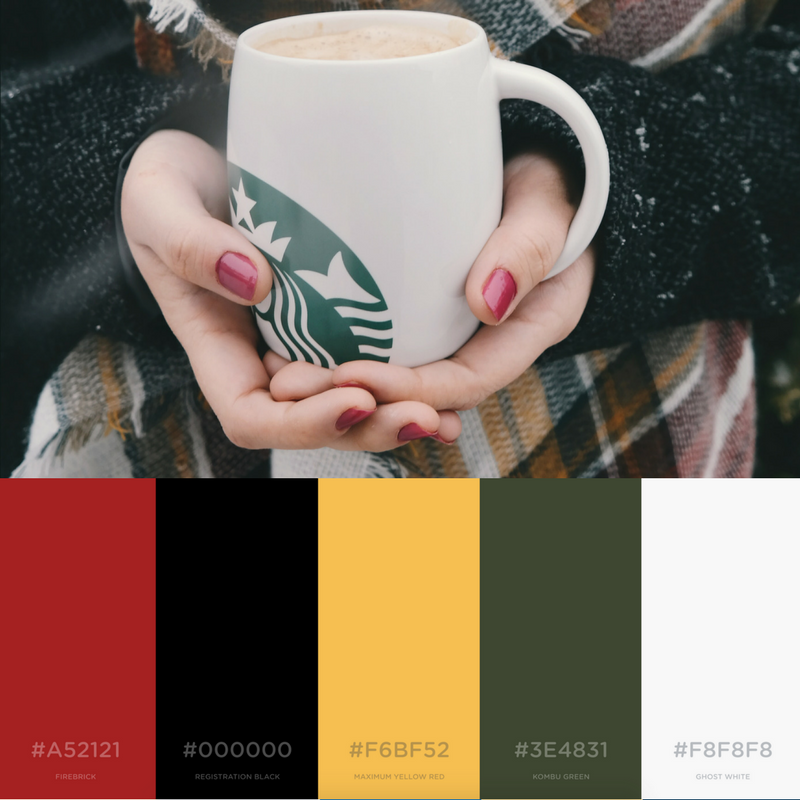
Plaid + Starbucks + Red Nails = Winter goals! If we could click our heels together twice and transport ourselves anywhere, it’d be here. Nothing is better than a strong red accompanied by other warm yet serious tones like green, a warm butter yellow and black.
Corner Cuddles
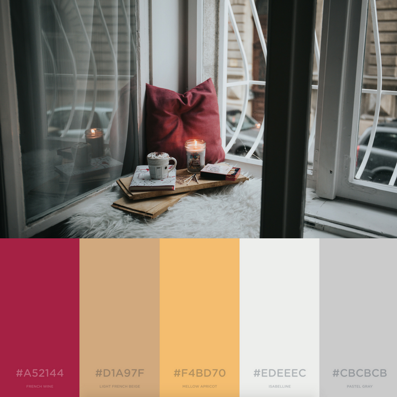
One can never get enough red during winter. Whether it is a powerful one like the previous picture or it’s a sweet red with purple undertones, it’s just too good. Paired with a warm tan and golden yellow, it’s the perfect complement for the icier whites and grays.
Periwinkle Plates

In my winter wonderland, it’s all purples and pinks. These cooler tones emphasize the special nature of the season which is full of magic, family time, sugar plum fairies, and glitter. We love this calming image of one the most northern places full of ice plates.
Fragrant Forest
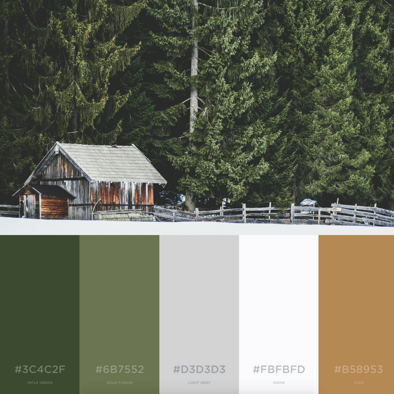
How badly do you wish you could bottle of the scent of evergreen trees? I don’t know about you but pine scented candles are a staple in my house all year long. If I could transport to this gorgeous vista for just a few moments, I would spend the time savoring the fragrant air. When you think of winter, you don’t typically imagine healthy, green trees but these majestic trees prove us wrong.
Aqua Air

What’s better than a trie of blues? From the stable royal blue to the two more playful blue tones, this image captures them all. The platinum and white tie together the look, helping us to imagine the brisk sea air.
No matter your reason for inspiration need, we bet our palettes can help you create a new color scheme inspired by winter! If you have a palette you love, reach out to us! We’d love to spotlight it in our next edition of color palettes!
Still looking for palette inspiration? Check out our blog post on branding color palettes inspired by summer and fall.
All photos from Unsplash and color palettes from Coolors.
Latest posts by Guest Author (see all)
- How To Own The Holidays - December 21, 2018
- Marketing Analytics 101 - November 28, 2018
- What a Marketer Should Do on Thanksgiving - November 16, 2018